Menus
Here, we'll explain the various menus lined up in the menu bar of LinearGraph3D, along with an overview of each item.
In the "File" menu, you can mainly find functions related to file input and output, such as opening data files to plot graphs, and saving/loading configuration files.
Open File
Opens a data file and plots it on the graph.
To use, first press the "OPEN" button and select the file. If you want to plot multiple files together, select them similarly. Finally, press the "PLOT" button, and the data from all selected files will be plotted on the graph.
Additionally, data loaded from different files is distinguished as different series and can be color-coded. To enable color-coding, turn off "Gradient" under "Options".
Open Data
Allows you to directly "paste" text content written in the same format as a data file and plot it. This is useful for plotting from spreadsheet software, among others. Note that this item can also be accessed by right-clicking on the graph screen and selecting "Paste Data".
To use, paste the data into the text area labeled "Data:". Then, press the "PLOT" button, and the data will be plotted on the graph.
Save Data
This function consolidates the current graph's plotted data into a single data file for export. However, some forced conversions may occur, such as formatting all data into three-column format. It may be useful for minor record-keeping during analysis.
This feature was implemented in the early days when automated processing via VCSSL was not supported. Nowadays, if you want to easily re-plot multiple data files or make adjustments, it's recommended to write a script in VCSSL. This approach makes it easier to understand what is being plotted and allows for easy fine-tuning and replacement.
Save Image
Saves the current graph as an image file in PNG, JPEG, or BMP format. PNG is recommended for image quality, while JPEG is preferable for reducing file size.
Additionally, you can copy the graph image directly from the right-click menu on the graph screen. This is convenient for pasting the image into other applications (such as spreadsheet software) without saving it to a file.
Save Setting
Saves the current graph settings to a file.
To use, first select the settings you want to include in the configuration file (the ones you want to reproduce when loading). Then, specify the location and file name for the configuration file. Finally, press the "SAVE" button to save the configuration file.
Choosing "Quick Settings" as the save location enables easy selection and loading from the "Quick Settings Selector" in the upper right corner of the graph screen.
Load Setting
Loads the previously saved configuration file selected.
The "Edit" menu allows for detailed editing of the graph settings, such as axis ranges, labels, and camera angles. Note that plot options (e.g., whether to plot the graph with points or lines) are adjusted not from this "Edit" menu but from the "Option" menu described below.
Clear
Clears all currently plotted content.
Set Range
Allows you to set the range of the X/Y/Z axes individually. To use, simply input the minimum and maximum values for each axis and press "SET".
Additionally, turning on the "Auto Adjust on Plot" option automatically detects and sets the maximum and minimum values of the data when opening a data file. This option is enabled by default, so if you want to fix the range, please turn it off.
Set Label
You can change the labels of the X/Y/Z axes. For example, if you want to label the X-axis as "Longitude," the Y-axis as "Latitude," and the Z-axis as "Measured Value," simply input the desired labels and press "SET".
Set Color
When plotting data with multiple series or multiple files, it's often useful to differentiate series by color. You can set the colors for each series here. By selecting colors from 1 to 8, each series will be assigned a color starting from number 1.
To color-code the graph by series, you need to turn off "Gradient" in the "Options" menu.
Set Light
You can adjust the reflection intensity and direction of light during surface plotting. The effect of light is crucial for understanding the subtle undulations, roughness, and smoothness of surfaces. The following parameters are adjustable:
- Ambient Reflection
-
Adjusts the overall brightness uniformly. It does not provide any sense of depth.
- Directional Reflection
-
Controls the strength of the effect where brightness increases when facing the light source. However, areas in shadow, which are not facing the light source, remain completely dark, resulting in distinct shadows. It is used in combination with Diffuse Reflection.
- Diffuse Reflection
-
Adjusts the strength of the effect where brightness increases when facing the light source. However, shadowed areas are also smoothly illuminated, resulting in blurred shadow regions. It is used in combination with Directional Reflection.
- Specular Reflection Intensity
-
Adjusts the intensity of glossiness. By setting it to a moderate strength and width, it becomes easier to intuitively understand the complex shapes of surfaces.
- Specular Reflection Critical Angle
-
Adjusts the width of the glossy region.
- Angle of Light Source (Vertical Angle, Horizontal Angle)
-
Specifies the direction of the light source using two angles as seen from the screen. The vertical angle is a kind of elevation angle, where 0 corresponds to directly above the screen and the maximum angle corresponds to directly below. The horizontal angle rotates around the axis of the screen's vertical direction.
Set Camera
You can adjust the viewing angle of the graph, camera angle, distance and magnification, and screen size.
Additionally, you can toggle the presence of "perspective," which creates the effect of objects appearing smaller in the distance. You can also specify whether to enable "high-quality rendering," which smooths lines and text at a slight performance cost. Both options are enabled by default.
Set Font
You can set the font used for labels, tick marks, and other elements on the X/Y/Z axes.
It's important to note that fonts are generally protected by copyright, and you should use them according to their licenses. Especially when publishing graphs in books or other publications, make sure to use fonts permitted by their licenses. For example, fonts provided by the Information-technology Promotion Agency, Japan (IPA), such as IPA Fonts or IPAex Fonts, are recommended options.
Set Scale
You can finely adjust the number of ticks, their format, and other settings for the tick marks on the X/Y/Z axes.
Additionally, you can paste images onto each face of the graph's cuboid. However, in the current version, image rendering is resource-intensive. To reduce the load, the resolution is lowered (adjustable) when loading images. Using high-resolution images without adjustment can significantly increase the load.
Details
You can select the design of the frame from the "Frame" dropdown:
- BOX TYPE�F
- A simple box-like frame (default).
- BACK-WALL TYPE�F
- Similar to the "BOX TYPE" frame, but only the inner side of the box's planes is visible.
- FLOOR TYPE�F
- The frame consists of only the floor plane.
- NONE�F
- No frames will be rendered in this mode.
The interval between scale ticks (and grid lines) can be specified using the "Number of Sectors" text field.
If you want to modify the format of the scale numbers, please disable the "Auto" checkbox in the "Format" column and input a format string into the text field as follows:
- "0.00" to format numbers like "1.23"
- "0.00E0" to format numbers like "1.23E4"
- "0" to format numbers like "1"
In addition, you can control the visibility of the scales by enabling or disabling the checkboxes in the "Visibility" column when the "Auto" checkbox in that column is disabled.
With Lines
Connects adjacent coordinates in the data with lines.
With Points
Places a point at the position of each coordinate in the data.
With Dots
Similar to point plotting, but places very small points of 1 pixel.
With Balls
Similar to "With Points" option but is an old feature and is currently treated as compatibility support.
With Meshes
Draws grid data (*) in a mesh format.
With Membranes (Surfaces)
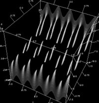
Draws grid data (*) as a surface. This is commonly known as a surface plot.
With Contour
Draws grid data (*) as a surface. This is commonly known as a contour plot.
* About grid data
To use the mesh plot, membrane (surface) plot, and contour plot features, the data file needs to be formatted to represent a surface. For more details, please refer to the Data File Format page.
Additionally, when plotting array data directly using VCSSL or Java, you need to pass a 2D array in which the data is stored in a grid pattern.
With Comments
Draws the content of the fourth column of data described in the 4-column format as text at each coordinate position.
Custom Plot
Used when specifying different options for each series. Note that it cannot be used in conjunction with the animation feature.
Log X/Y/Z
Converts the X/Y/Z axes to logarithmic scales.
Reverse X/Y/Z
Inverts the direction of the X/Y/Z axes.
Flat
Sets one of the lengths of the X/Y/Z axes to zero, making the graph flat.
Black Screen
Option to set the background to black. It's enabled by default, and disabling it changes the background to white.
A black background enhances visibility of colors for points and lines, making it suitable for work on PC monitors. However, it tends to produce poor results when printed. A white background, on the other hand, is suitable for printing but may make it difficult to see certain elements on a PC monitor (especially yellow points or lines).
Gradation (Gradient)
Colors the entire graph using gradients based on the values of the X/Y/Z components or the values in the fourth column of the data. It's enabled by default, and disabling it colors each series of data separately.
Grid Line
Toggles the display of grid lines drawn on each surface of the graph (enabled by default).
Frame
Toggles the display of the outer frame lines of the graph (enabled by default).
Scale
Toggles the display of ticks on the graph (enabled by default).
Label
Toggles the display of axis labels on the graph (enabled by default).
Tessellation
An option to smooth out mesh/surface/contour plots by densely interpolating grid data. Be cautious as excessive interpolation can significantly increase rendering load.
See-Through (Semi-Transparent)
Makes the entire graph semi-transparent. Note that rendering transparent colors is considerably more resource-intensive than rendering opaque colors, so exercise caution when using this option with dense data.
The "Tool" menu provides various auxiliary tools.
Animation
A tool for animating graphs. For details, please refer to [the section on Animation](./animation).
(Legacy) Math
This is a legacy tool implemented in much older versions and is retained for compatibility. It allows plotting of equations in the form z = f(x,y). However, variables x and y need to be enclosed in angle brackets, like <x>. Unless necessary, the formula plot tool in the "Program" menu is recommended. It supports more formats and processes faster.
Paint
This tool enables coloring specific regions within the graph. It's also a legacy tool retained for compatibility, though its usability is poor. There might be situations where it's necessary to use it due to lack of alternatives. Improvement is expected in the next version.
"Program" Menu
The "Program" menu allows executing scripts written in the simple programming language "VCSSL".
RINEARN Graph 3D supports control and automation through VCSSL. Writing scripts for such processes and storing them in the "LinearGraph3DProgram" folder allows for easy execution from this menu. For details, please refer to the section on Control and Automation with VCSSL.
Additionally, some scripts, such as the math plot tool, are included by default. For details, please refer to the section on How to Draw Math Expressions.
Author of This Article
Fumihiro Matsui
[ Founder of RINEARN, Doctor of Science (Physics), Applied Info Tech Engineer ]
Develops VCSSL, RINEARN Graph 3D and more. Also writes guides and articles.
Translation Cooperator
ChatGPT AIs
[ GPT-3.5, 4, 5, 5.1 ]
We greatly appreciate the cooperation of ChatGPT AIs in translating this article.